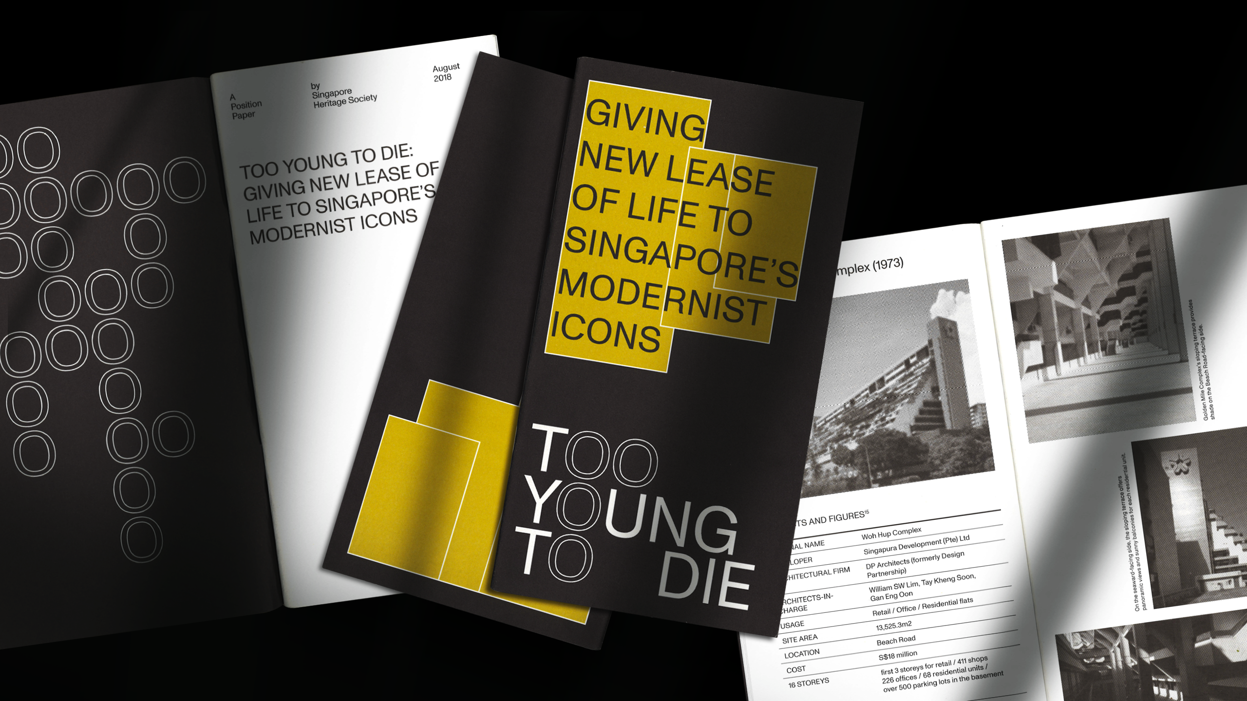
Too Young to Die: Giving New Lease of Life to Singapore’s Modernist Icons
Client ︎︎︎ The Substation
Year ︎︎︎ 2018
Service ︎︎︎ Identity, Editorial, Exhibition
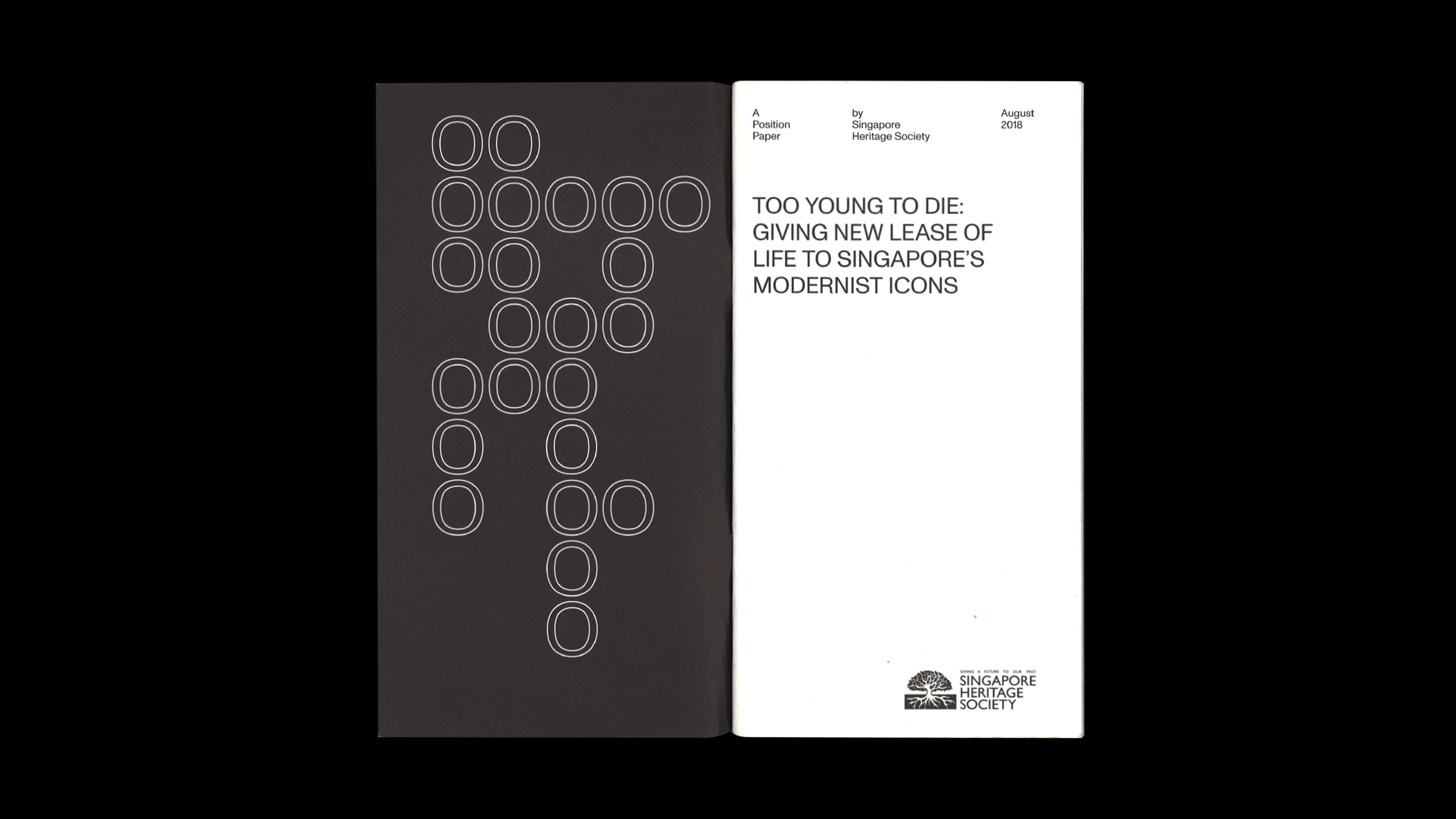
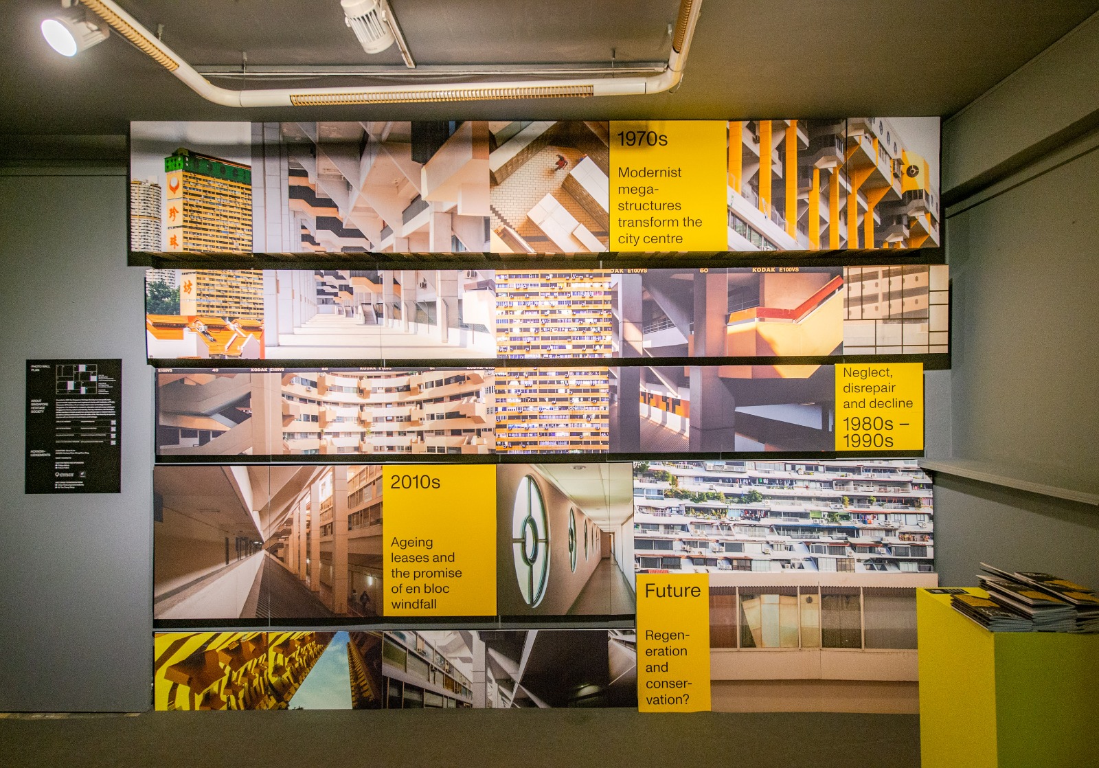
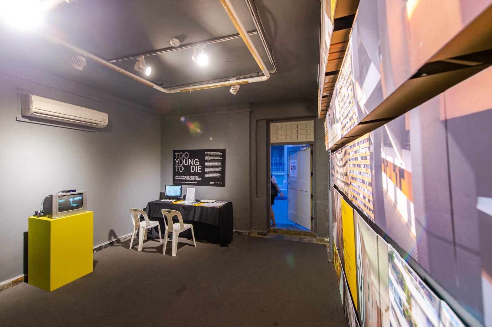
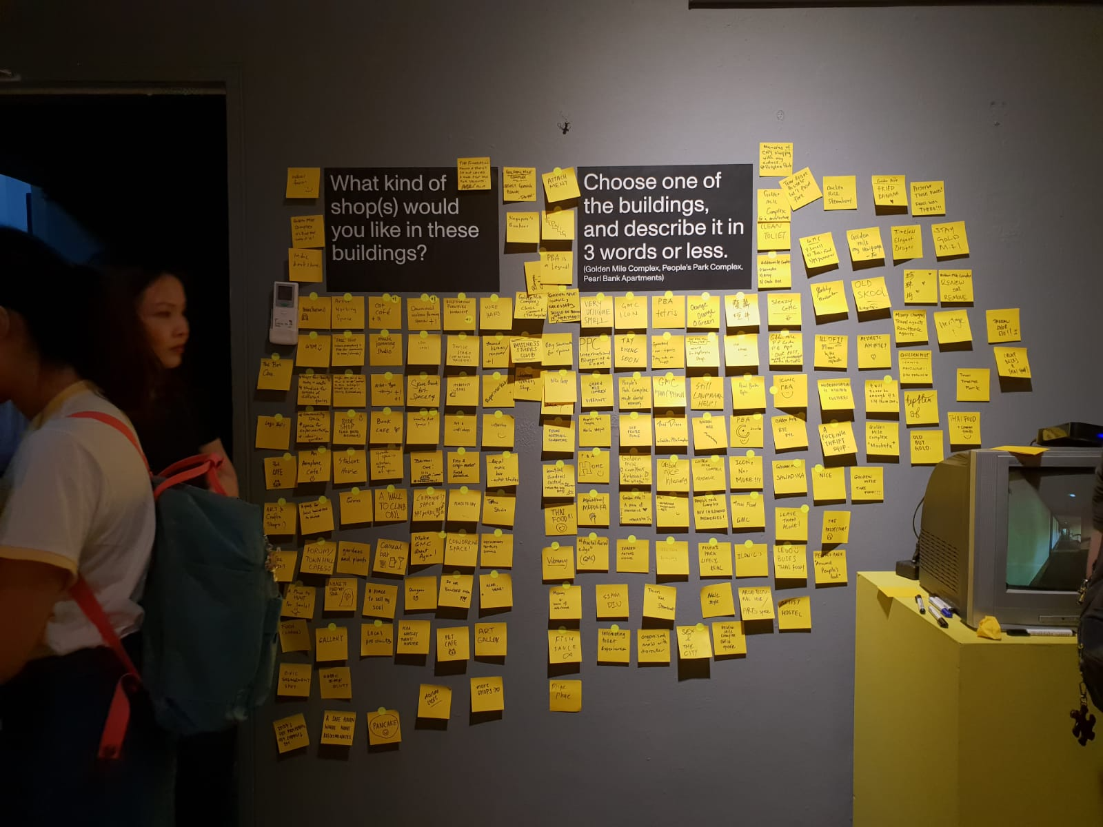
Too Young to Die is an exhibition that functions as a three-dimensional position paper that examines the past and present of three Singapore modernist icons—People’s Park Complex, Pearl Bank Apartments and Golden Mile Complex, which at the time faced the threat of collective sale and demolition. Working closely with the Singapore Heritage Society, CROP was responsible for the visual identity, the exhibition design and the printed collaterals accompanying the exhibition.
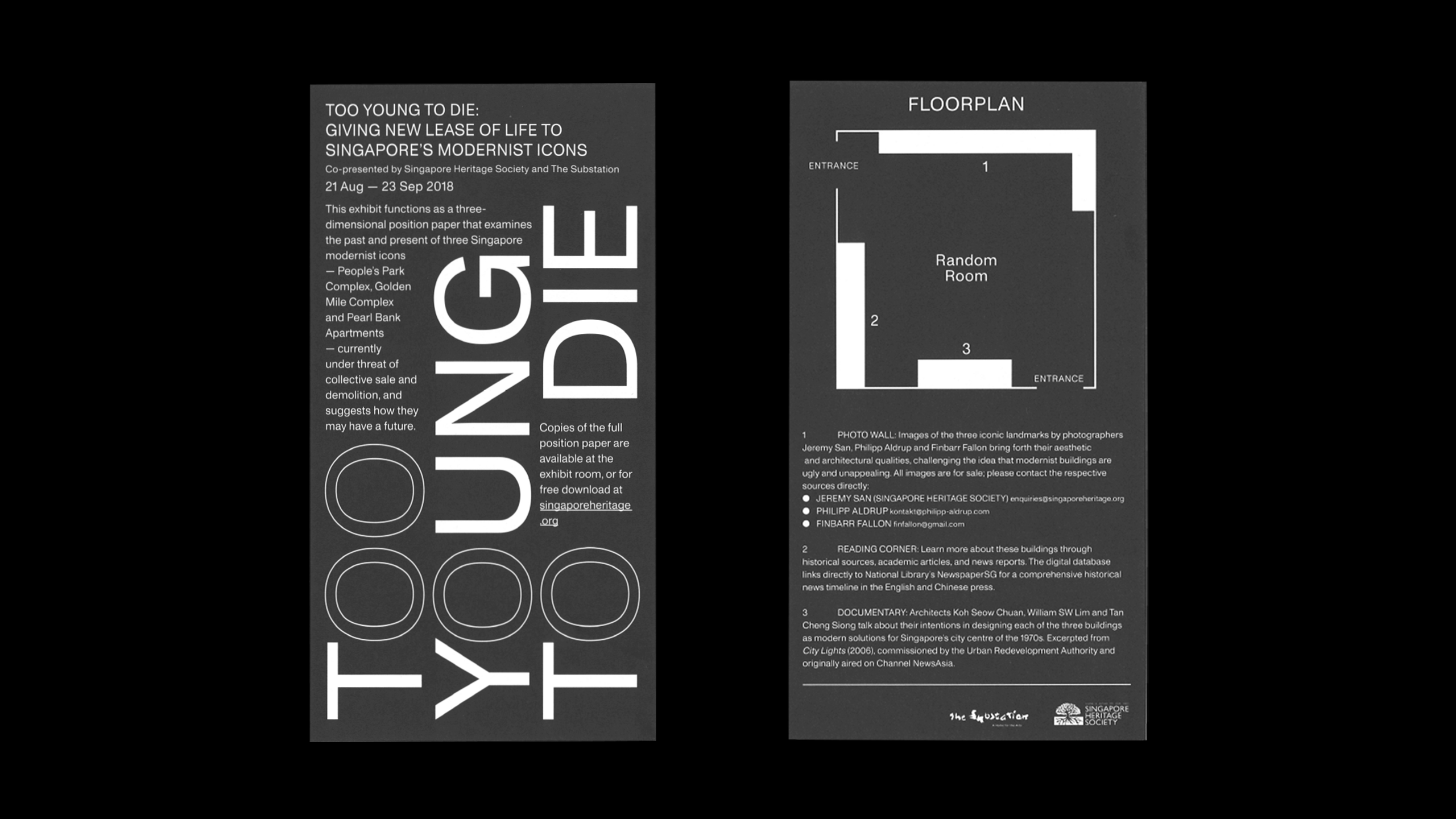
The design of the visual identity draws from brutalist architecture, with the exhibition title typeset in a single font weight, an ode to the choice of the predominance of a single material (raw concrete) seen on the exteriors of brutalist architecture. The contrasting letters ‘O’ in the title also highlights the modularity designed into metabolist buildings.
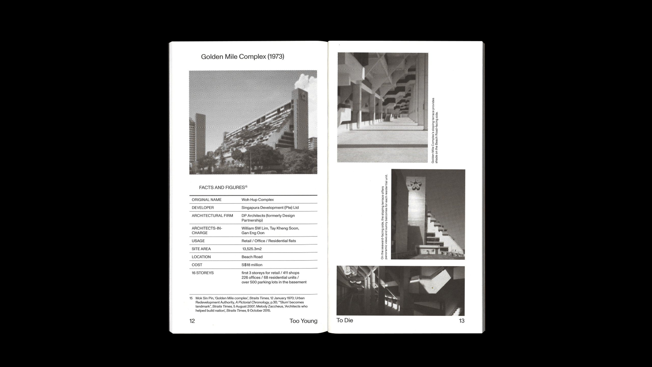
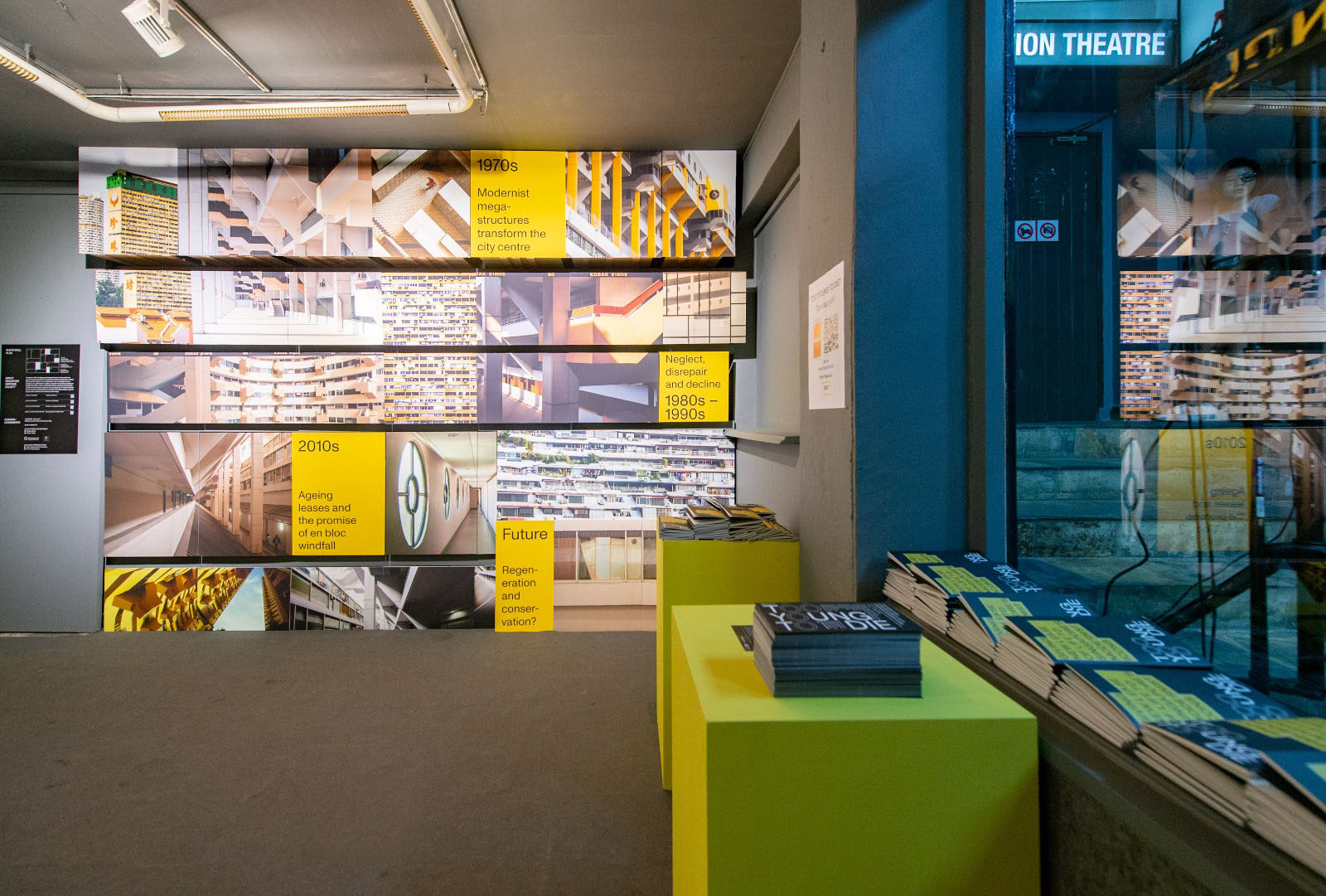
We divided the exhibition space into three main sections; a feature wall, a reading corner and a documentary. Our proposal was to imagine the space as a synergy of the three modernist icons. The walls were painted in a grey tone that mimics raw concrete, while the feature wall comprises receding blocks that visually reference the architecture of Golden Mile Complex. A hint of yellow hue was applied sparingly to the space, a colour that is prominent in the three buildings and the finishing touches of the space were kept intentionally raw.
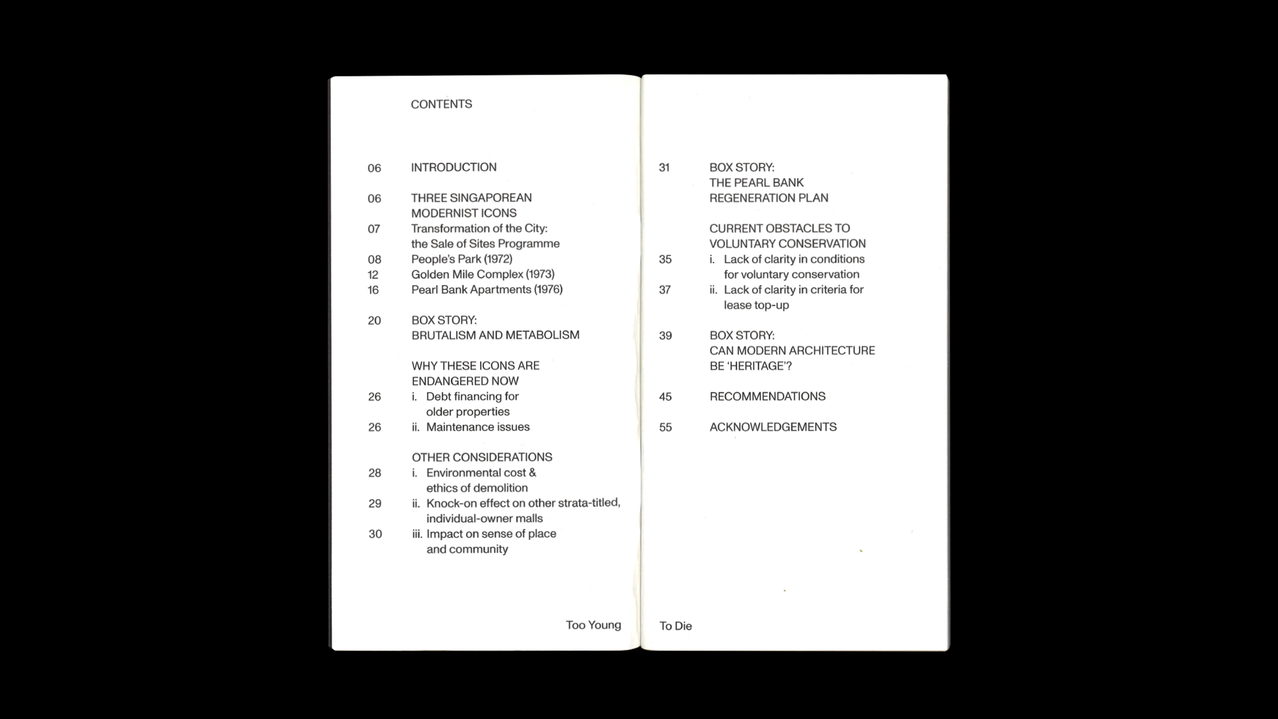
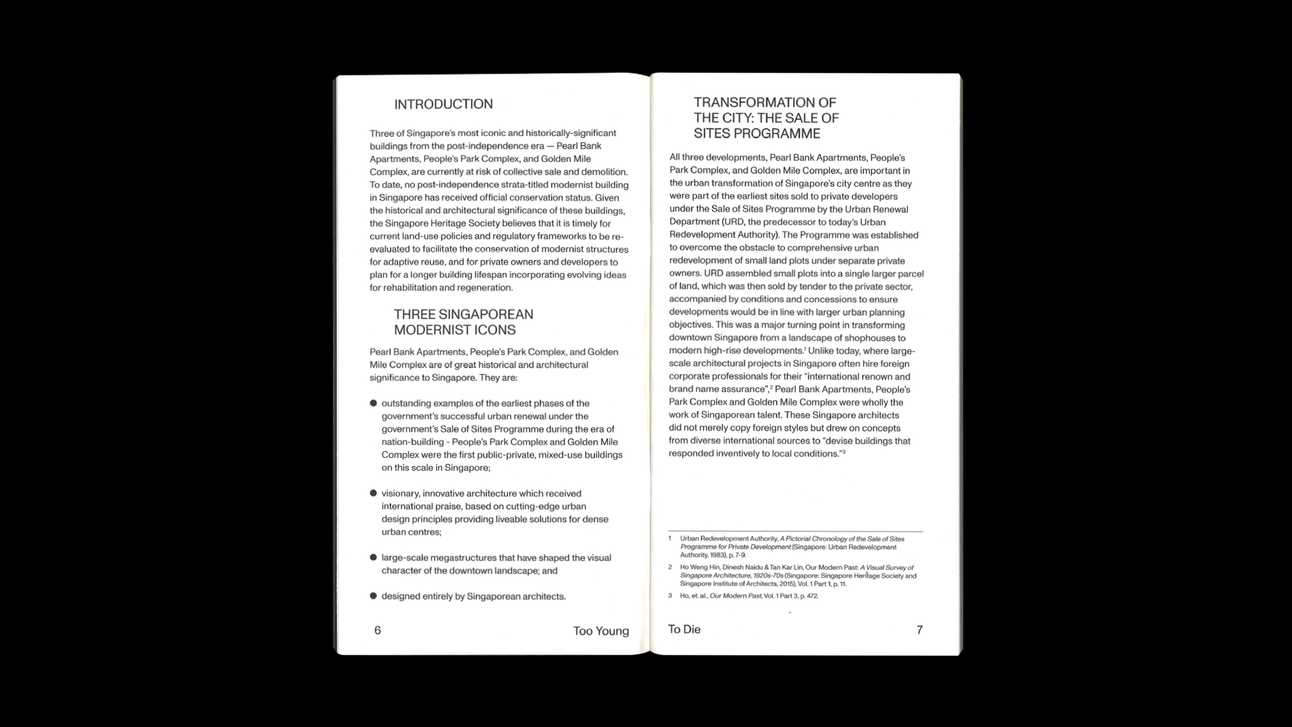
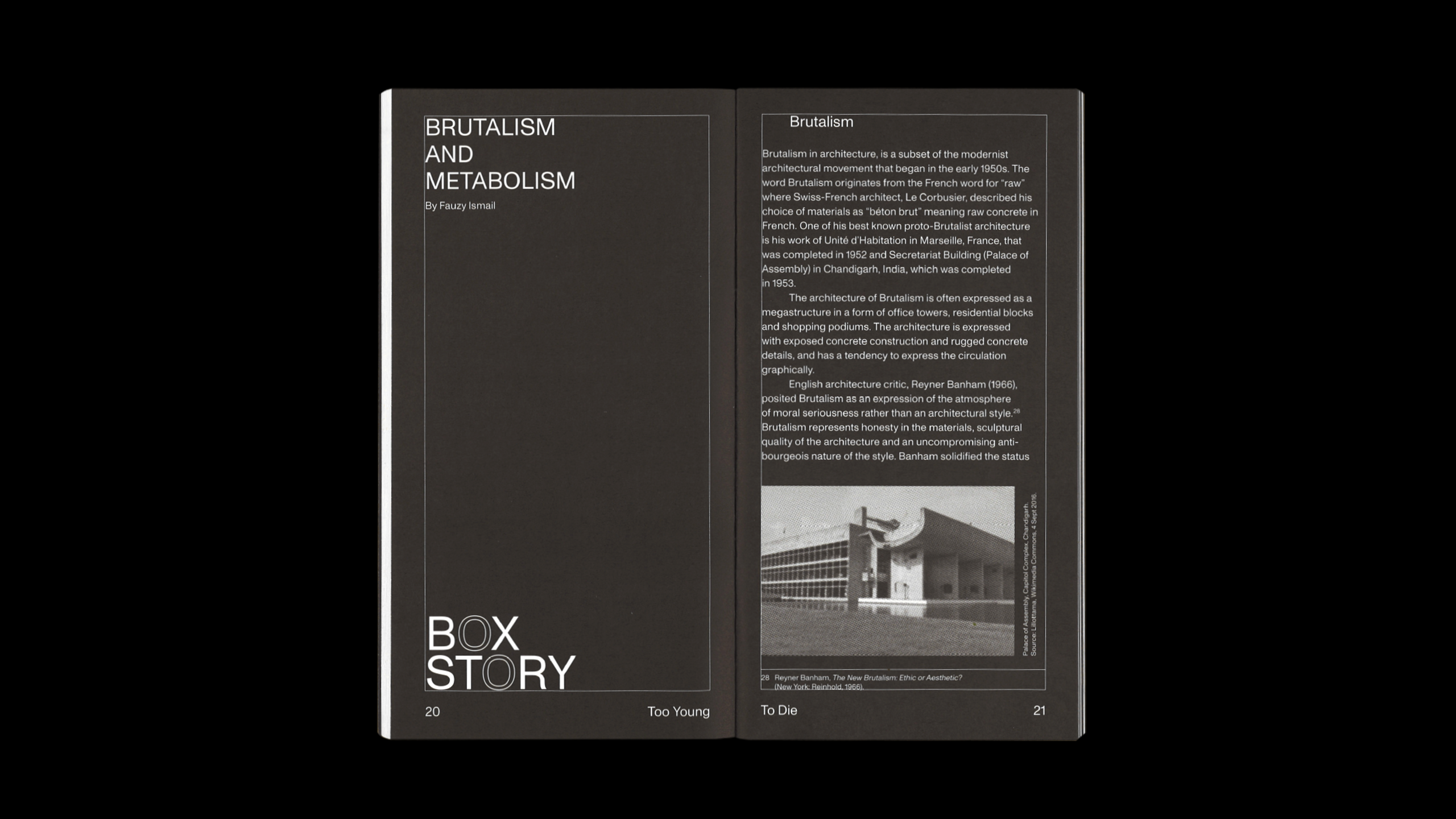
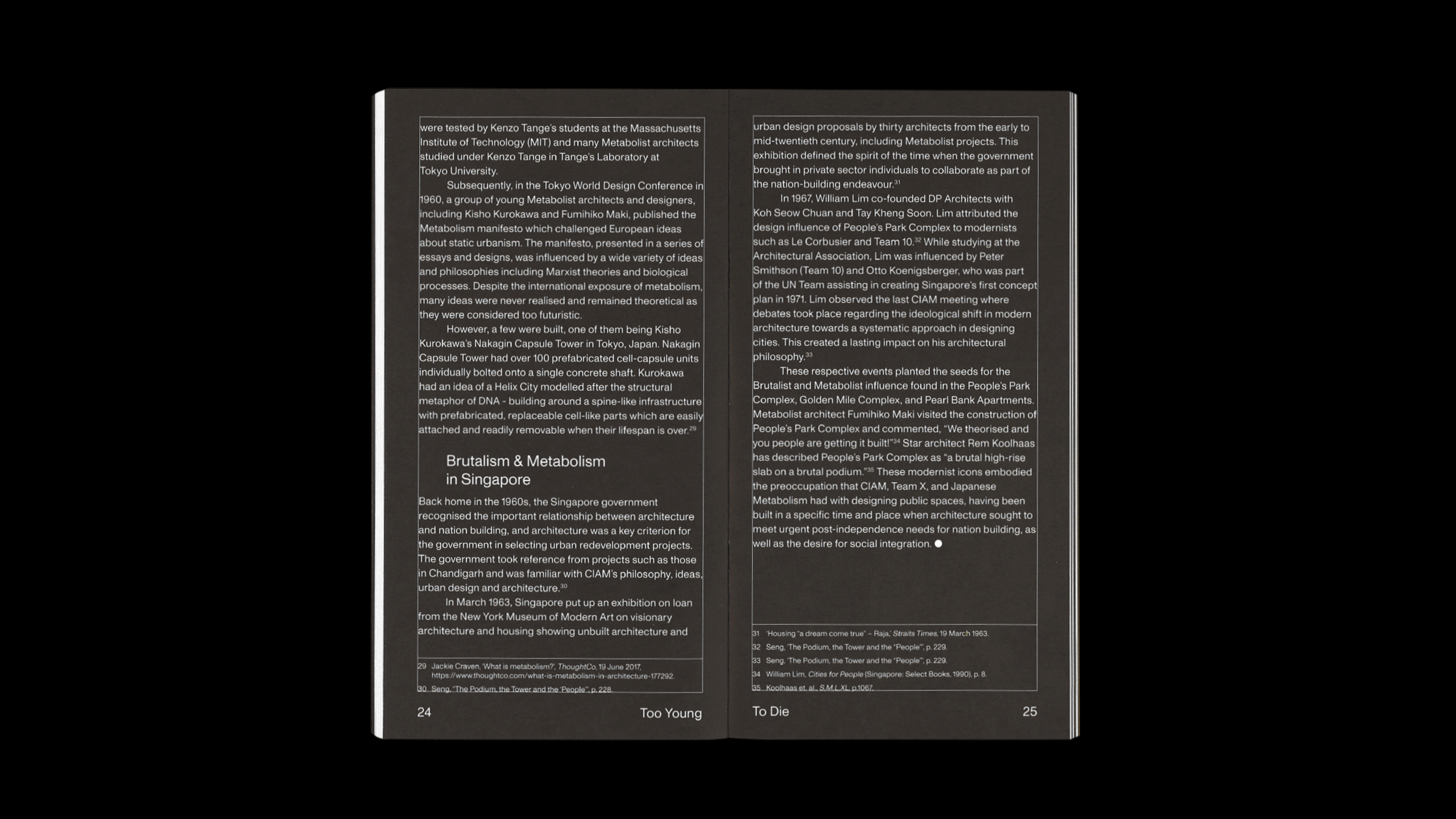
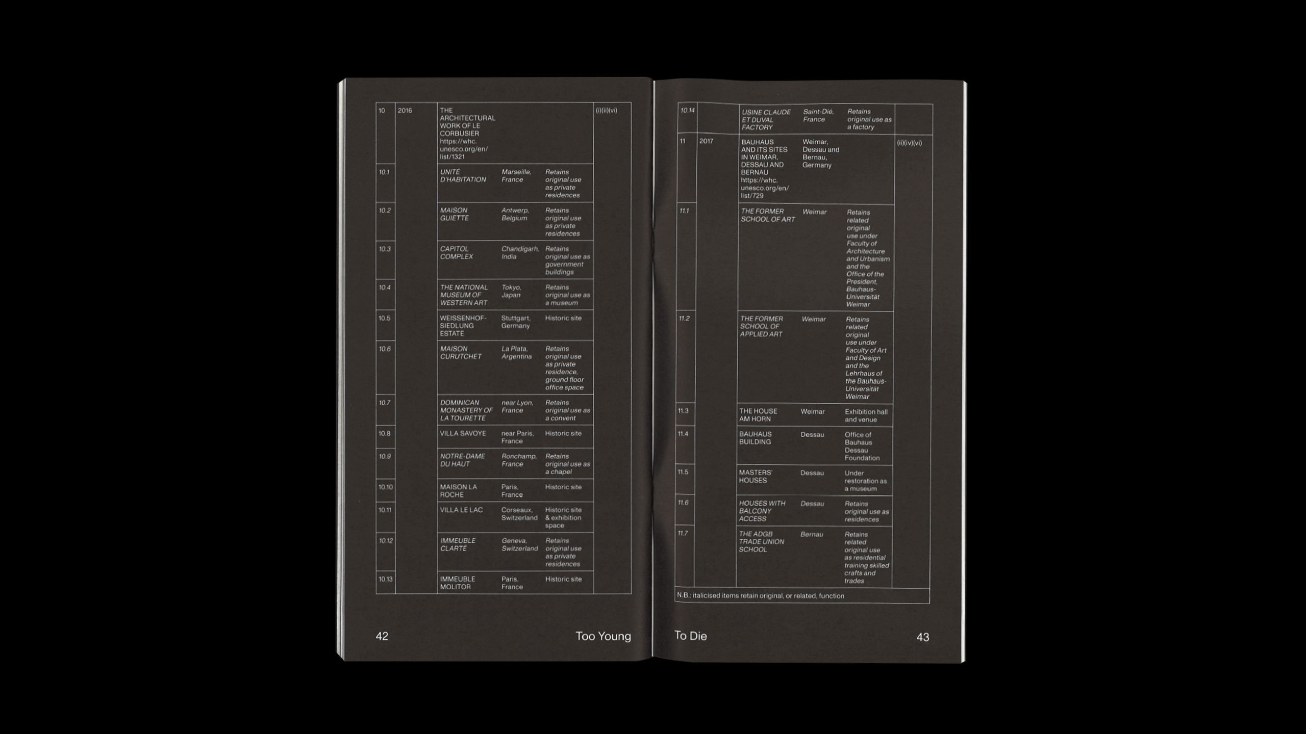
The design of the publication draws from Modernist design traditions, where function dictates form. By typesetting the publication in only one weight, and by only using the color black within the contents, it creates a spectrum of grey tones, the preferred palette of choice for brutalist architecture.

